StarTrekker (talk | contribs) |
Tag: Reply |
||
| Line 300: | Line 300: | ||
It was pointed out at [[Wikipedia:Requests for comment/Deployment of Vector (2022)]] that the new skin crowds tables and images to such an extent that it misplaces and awkwardly stacks them. This was, and still is, evident on the very article supplied as an example in the RfC, [[Pluto]], See [[Pluto#Mass and size]] section. This is happening on countless articles. See [[2022 Formula One World Championship]] for example. It's mess now with the new skin. --[[User:DB1729|<span style="font-family:Times New Roman;color:#4B0082;">'''''DB'''''</span><span style="color:DeepSkyBlue"><small>'''''1729'''''</small></span>]]<sup>[[User talk:DB1729|<span style="color:#4B0082;">'''''talk'''''</span>]]</sup> 19:54, 18 January 2023 (UTC) |
It was pointed out at [[Wikipedia:Requests for comment/Deployment of Vector (2022)]] that the new skin crowds tables and images to such an extent that it misplaces and awkwardly stacks them. This was, and still is, evident on the very article supplied as an example in the RfC, [[Pluto]], See [[Pluto#Mass and size]] section. This is happening on countless articles. See [[2022 Formula One World Championship]] for example. It's mess now with the new skin. --[[User:DB1729|<span style="font-family:Times New Roman;color:#4B0082;">'''''DB'''''</span><span style="color:DeepSkyBlue"><small>'''''1729'''''</small></span>]]<sup>[[User talk:DB1729|<span style="color:#4B0082;">'''''talk'''''</span>]]</sup> 19:54, 18 January 2023 (UTC) |
||
:This is a longstanding issue that severely impacts our mobile readers (forcing them to have horizontal scroll on the entire article). It an be fixed by editors like in [https://en.wikipedia.org/w/index.php?title=2022_Formula_One_World_Championship&diff=1134459110&oldid=1134321642&diffmode=source this change] using the instructions on [[mw:Recommendations_for_mobile_friendly_articles_on_Wikimedia_wikis#Wrap_wide_images_and_tables]]. [[User:Jdlrobson|Jdlrobson]] ([[User talk:Jdlrobson|talk]]) 20:22, 18 January 2023 (UTC) |
|||
== The lack of space between the lead section and rest of the content makes every article look like a stub == |
== The lack of space between the lead section and rest of the content makes every article look like a stub == |
||
Revision as of 20:22, 18 January 2023
Invitation to try out the skin
Perhaps the invitation to try out the skin can be made less imperative? For example: The Wikimedia Foundation Web team strongly suggests trying it for at least one week, as it can take a few days to start feeling comfortable with a new interface. If you are unsatisfied, you can switch to any of our other skins at any time.
isaacl (talk) 22:52, 13 January 2023 (UTC)
- Hi @Isaacl. Thanks for your suggestion. I've edited the sentence. What do you think of the current wording? SGrabarczuk (WMF) (talk) 15:56, 14 January 2023 (UTC)
- Thanks for the changes; I feel it's more friendly this way. I have a minor copy edit to suggest to the first sentence for more conciseness:
If you decide to try it out, we, the Web team, suggest trying it for at least one week prior to deciding whether to switch to one of our older skins.
I appreciate your responsiveness. isaacl (talk) 17:45, 14 January 2023 (UTC)- I've simplified the sentence using your copy edit; in the future, feel free to make such improvements yourself :) SGrabarczuk (WMF) (talk) 17:49, 14 January 2023 (UTC)
- Thanks for the changes; I feel it's more friendly this way. I have a minor copy edit to suggest to the first sentence for more conciseness:
Graphic images in Vector 2022 search results
Apologies in advance if this sounds a little silly given Wikipedia's policies. Just switched to using Vector 2022 and, given that its wide rollout to the default skin is only a few days away, I feel it prudent to put it out there that I have noticed a potential issue with a new feature where images appear when using the search bar. For instance, if a user were to innocently search for 'peninsula', the 'penis' article appears while typing (thanks to the first four letters matching) complete with, for lack of a better phrasing, a photograph of an elephant's schlong. This is still far from the worst such example!
I fully understand that Wikipedia is not censored and such images are often necessary for the encyclopedic value of the articles where they are placed. However, on the old skin these pictures never appeared while using the search bar, so people making innocent searches didn't have to see them. A new Wikipedia user could be discouraged from using the site if they are offended and/or disturbed by the images appearing as they try to search for topics that aren't explicit at all. This seems especially likely if they're not logged in, with no idea how to hide the images.
On that note I am curious to know what (if anything) will be done to prevent these unfortunate incidents while not compromising the quality of the articles. I am wondering if there will be some sort of technical means implemented to hide specific images from search results and previews, like how the bad image list ensures certain pictures (many of which are sexual, violent or otherwise considered repulsive by many) aren't shown on pages other than which they are allowed. There could also be an option for logged-in users to choose whether to allow explicit images in their search results, with the default setting being to hide them.
Thanks for taking the time to read through this and would love to know your thoughts on the matter. Entranced98 (talk) 03:16, 14 January 2023 (UTC)
- This is a decent point. While we've traditionally had WP:NOTCENSORED, some of this is based on the philosophy that someone visiting the penis article should expect to see a penis. It's obviously not the same philosophy if you're given search suggestions when trying to find a different article, and of course we do avoid potentially objectionable material on unrelated articles, if there is no clear encyclopaedic purpose. (Wikipedia:Offensive material is a decent summary.) ProcrastinatingReader (talk) 13:03, 14 January 2023 (UTC)
- These images have appeared like this on mobile for some time, so just imagine what all the mobile users have to deal with. :)
- There is a separate list (MediaWiki:Pageimages-denylist) that can be used to eliminate search results without affecting the page directly. You can also add
|class=notpageimageto a specific image if it's inappropriate to be the page image. As page images are only ever used in 'secondary' locations, this concern is a good reason to use the class. (I don't know if all infoboxes support the second option today.) - That there is a second list is the subject of phab:T306246. Izno (talk) 18:05, 18 January 2023 (UTC)
Scripts for power users
I'd love to see a collection or contest of the best scripts to extend the new skin. There's a lot of great improvements here but also a bunch of new annoyances for power users (that will either subside with acclimation/time or be tweaked through CSS user scripts). czar 03:26, 14 January 2023 (UTC)
- Hey @Czar! That's a nice idea. We're keeping such a list here. If you'd like to create a local list here on English WP, I'd suggest keeping these two in sync. SGrabarczuk (WMF) (talk) 15:52, 14 January 2023 (UTC)
Keep the old skin
I am against changing the Wikipedia design. I hate Vector 2022. SonicIn2022 (talk) 15:44, 14 January 2023 (UTC)
- the main issue you cannot hide on mobile the contents on the left, it is not saved. Which makes reading stuff impossible. So much for dynamic rendering. Valery Zapolodov (talk) 21:29, 14 January 2023 (UTC)
- @Valery Zapolodov You can??? Just press hide for the table of contents and the《 for the actual sidebar Aaron Liu (talk) 02:18, 15 January 2023 (UTC)
- It is not preserved. You need to press it every time. Valery Zapolodov (talk) 12:02, 15 January 2023 (UTC)
- @Valery Zapolodov You can??? Just press hide for the table of contents and the《 for the actual sidebar Aaron Liu (talk) 02:18, 15 January 2023 (UTC)
- @SonicIn2022 Have you tried for at least a week? Any overhaul would require a week to get used to. What specific grievances do you have against the new skin? Also, we’re not going to remove the old skin as your title “keep the old skin” suggests, you can always change it in settings. Aaron Liu (talk) 02:20, 15 January 2023 (UTC)
- I already tried it on Miraheze. The new skin sucks. SonicIn2022 (talk) 13:10, 15 January 2023 (UTC)
- The Miraheze version hasn't had a lot of new fixes introduced yet, Miraheze is on 1.38 while the latest version is 1.39. Try it out on THIS wiki. Plus, what specific grievances do you have towards the new skin? The possibility that it hasn't been bought up in the mentioned rfc is very low. Aaron Liu (talk) 15:19, 15 January 2023 (UTC)
- I already tried it on Miraheze. The new skin sucks. SonicIn2022 (talk) 13:10, 15 January 2023 (UTC)
Keep the old buttons
If I hide the menu, it turns into one of those Google-influenced three-line menu icons. This is dumbed-down mobile phone iconography. When I started using mobile phones (grudgingly) its meaning was mysterious to me. On the English Wikipedia, why can't it just be a button that says "menu", you know, in English? Isn't this a site for people who can read? Similarly, if I want to log in now, I have to press a button that looks like three dots. In what way does three dots mean "log in"? Is this another icon with a familiar meaning to the young and stupid? It doesn't mean anything to me, and why could it not be a button written in English which says "log in"? And then there's the contents on talk pages: when hidden (which I will be doing all the time because the changes take up too much screen space) it becomes an icon consisting of three lines with bullet points, which you're supposed to infer is some kind of menu different from the first kind of menu, and thus means "contents" ... right? But what would be wrong with a button that says "contents"? This site is not for an international audience. The articles are not written in pictograms. Why do the buttons have to be like that? Card Zero (talk) 20:19, 18 January 2023 (UTC)
Width issue
The Vector 2022 update looks alright, however the default appearance with "limited width mode" is a major waste of monitor space. I recommend that limited width mode is disabled by default when the update goes through. Cards84664 16:18, 15 January 2023 (UTC)
- Hi @Cards84664. Thanks for your general support. Of course, you're free to disable the limited width permanently in your preferences. (Un-check the option "Enable limited width mode" or click the toggle in the bottom right corner of the screen.)
- However, regarding the default view for everyone, I'd like to recommend reading the section of the FAQ: Why is the width of the content limited?. Also note the UX Myth #28: White space is wasted space. You'll find even more information on this feature page on MediaWiki.org.
- In the future, we, the Web team, would like to talk about the possibility of increasing the default font size (of course, having addressed a number of issues with tables, navboxes, infoboxes, etc.). That would be implemented together with an increase of the (still limited) default width. I'm not encouraging (or trying) to start this conversation now, though.
- Thanks! SGrabarczuk (WMF) (talk) 17:24, 15 January 2023 (UTC)
- For times when limited width was needed there was an exceedingly easy solution in the old UI: resize the window. In the old system snapping the window to one side of the screen had the same effect as this, without forcing it on you in the many cases where it makes for a worse experience.
- In the new UI, the large amount of white space and the narrow article leaves the reading experience feeling very squeezed, claustrophobic, and even oppressive. If you're talking about increasing the font size that's going to make it even worse. 2607:FEA8:2D24:8900:0:0:0:151C (talk) 18:44, 18 January 2023 (UTC)
- Per https://uxmyths.com/post/2059998441/myth-28-white-space-is-wasted-space - the examples given as "Some beautiful websites with generous white space" now use minimal whitespace compared to uxmyths.com or the new mediawiki skin - it may have been true a few years ago, but the new thing seems to be using the entire screen, but limiting the size of each "section" of the page such that the entire page can be filled with these "sections", rather than just using a minority of the screen for the content and keeping the rest blank, which is what uxmyths and vector 2022 both seem to do. 1rre (talk) 19:03, 18 January 2023 (UTC)
- Somewhat Agree. I understand whitespace is a critical, yet subtle part of web design, however there are times where I would like more text on screen at once, such as if I'm multitasking and cannot easily scroll the page. Perhaps a toggle button on the page between limited and unlimited width mode that dynamically resizes content (while keeping you where you were on the page) would be useful. Of course, I also understand that it is likely too late to even consider including design elements like that, but that is something I would appreciate. Deathstar3548 (talk) 22:14, 15 January 2023 (UTC)
- @Deathstar3548 - thanks for your question! Such a toggle button is currently available. The button is available on the bottom right side of the screen and it is persistent as you scroll down the page. You can also set the width to default to full with from the appearance section of your preferences by unchecking the enable limited width mode checkbox. OVasileva (WMF) (talk) 15:28, 16 January 2023 (UTC)
- Yes please do disable limited width mode. Having this enabled was putting me off Vector 2022. Aaron106 (talk) 16:11, 18 January 2023 (UTC)
- Wider tables benefitted from the wider screen. The sideways compression has produced an amateurish appearance for such tables. It would be more useful to restore the former version as the default and make the new version an option for those who may find it useful. DMBanks1 (talk) 17:36, 18 January 2023 (UTC)
- The button is bugged. Opening a new page resets it back to limited width mode every time. 2607:FEA8:2D24:8900:0:0:0:151C (talk) 18:35, 18 January 2023 (UTC)
- Yes please do disable limited width mode. Having this enabled was putting me off Vector 2022. Aaron106 (talk) 16:11, 18 January 2023 (UTC)
- @Deathstar3548 - thanks for your question! Such a toggle button is currently available. The button is available on the bottom right side of the screen and it is persistent as you scroll down the page. You can also set the width to default to full with from the appearance section of your preferences by unchecking the enable limited width mode checkbox. OVasileva (WMF) (talk) 15:28, 16 January 2023 (UTC)
how to KEEP the old skin?
Here we go again - there is a FAQ entry for turning off the new skin, but complete silence as to what I should do today to ensure I'm not switched away from my preferred skin: Vector legacy.
I'm not interested in Monobook, Timeless etc. I'm not interested in having a look at the new skin, even for a second. How do I decline the switch? CapnZapp (talk) 18:57, 15 January 2023 (UTC)
- I believe you'll be switched, but you can immediately go to your preferences and click Vector legacy (2010) to go back. It's right above MinervaNeue and Monobook. —Femke 🐦 (talk) 19:56, 16 January 2023 (UTC)
- CapnZapp - Femke is correct. We cannot decline. Declining this feature is not an option. Vector 2022 will be the default, all editors/readers will be switched over to Vector 2022 and then folks who don't want Vector 2022 will have to manually opt-out. Shearonink (talk) 00:21, 18 January 2023 (UTC)
- Just another example of the atrocious attitude WMF has towards its users then. With fiasco after fiasco where the engineers foist new functionality upon users (structured discussions, flow, banners you can only get rid of by overly technical changes, and a general insistence to dumb down the interface) with zero thought of asking them, allowing them to choose, and/or properly documenting "what if I don't want to?" it is clear the value put upon customer relations is next to zero. But thanks to you two for clearly stating and owning up to what the dev team clearly couldn't be bothered to! CapnZapp (talk) 07:00, 18 January 2023 (UTC)
- To add: obviously I realize that I could have switched temporarily to Minerva or Monobook just through the switch and then switch back. But why isn't even a single engineer asking the question "why do we force users that want no change to do change?" :-( CapnZapp (talk) 07:03, 18 January 2023 (UTC)
- CapnZapp - Femke is correct. We cannot decline. Declining this feature is not an option. Vector 2022 will be the default, all editors/readers will be switched over to Vector 2022 and then folks who don't want Vector 2022 will have to manually opt-out. Shearonink (talk) 00:21, 18 January 2023 (UTC)
Did I miss something? I thought this was supposed to happen today...so when - today, January 18th in this timezone - is Vector 2022 going to come online as the default? Shearonink (talk) 15:33, 18 January 2023 (UTC)
- @Shearonink See the § What to expect on January 18th, 2023 section Aaron Liu (talk) 15:36, 18 January 2023 (UTC)
- Nevermind...it seems to have just switched over at least on some pages...yuck...too much whitespace. Enabling my Vector Legacy preference in 3...2...1 Shearonink (talk) 15:55, 18 January 2023 (UTC)
- Oh CapnZapp, you might have to search around to find your Preferences. In the previous Vector iteration Preferences were laid-out in a single line across the top of the page. With Vector 2022 they've been moved to the very top right-hand corner, in sort of a drop-down menu arrangement or button. Shearonink (talk) 16:02, 18 January 2023 (UTC)
- I set my skin to 2010 globally a couple of days ago and wasn't switched over today, so something was possible. -- LCU ActivelyDisinterested ∆transmissions∆ °co-ords° 19:08, 18 January 2023 (UTC)
- Oh CapnZapp, you might have to search around to find your Preferences. In the previous Vector iteration Preferences were laid-out in a single line across the top of the page. With Vector 2022 they've been moved to the very top right-hand corner, in sort of a drop-down menu arrangement or button. Shearonink (talk) 16:02, 18 January 2023 (UTC)
- Nevermind...it seems to have just switched over at least on some pages...yuck...too much whitespace. Enabling my Vector Legacy preference in 3...2...1 Shearonink (talk) 15:55, 18 January 2023 (UTC)
Was this a beta feature?
Congratulations on Vector 2022, I like it! I think I was getting much of the appearance already because I had checked "Automatically enable most beta features" in Special:Preferences#mw-prefsection-betafeatures; I assume that preferences section had toggle(s) for the new appearance that are gone now that it's about to become the default. I don't know if this is worth mentioning on the page. -- Skierpage (talk) 06:32, 16 January 2023 (UTC)
- @Skierpage - thanks for your question! Yes, the preferences page allows you to switch the new skin on and off (as well as to choose any other available skin). It's located in the appearance section of the preferences page, under skins. OVasileva (WMF) (talk) 19:38, 16 January 2023 (UTC)
Feedback
I have not tried this new skin , but if it is anything like the change on Simple English Wikipedia I will find it difficult for a while. That appearance, makes editing and moving around on Wikipedia tedious. I could be wrong and the new Vector is brilliant. But my general feeling is that ”if it’s not broken why fix it”. We have a great design of the Wikipedia at present. --BabbaQ (talk) 08:40, 16 January 2023 (UTC)
- I tried out new Vector 2022 and didn't like it, nor any of the other skins. It looks and navigates too much like a mobile website. I don't use mobile devices except to maybe look something up when I'm on the go. I would never edit using the mobile interfaces. So I switched it back to Vector legacy. At least I feel confident now on how to access Preferences and switch it back after the auto-change (which hasn't happened yet, even though it's January 18 today). Grorp (talk) 01:32, 18 January 2023 (UTC)
- ”if it’s not broken why fix it” Since Wikipedia isn't fueled by adverts, this drive towards new and more users, and subsequently the constant desire to dumb down the interface that is excellent for experienced Wikipedians is incomprehensible to me. Unfortunately it appears WMF is hiring engineers that constantly must dabble to justify their existence :-( CapnZapp (talk) 07:07, 18 January 2023 (UTC)
- Yes it is great but I think there are a couple of grievances with the previous vector. Aaron Liu (talk) 13:12, 18 January 2023 (UTC)
- I don't like it at all, either. The notion that they are limiting width of content when most desktops use widescreen monitors is absolutely wild. This skin is a step back for sure. Melmann 16:33, 18 January 2023 (UTC)
- I agree. In what way is this better? The proportions of the various elements aren't well judged. And a bit more white space, fine, but why this much? There just isn't enough on the left in the navigation menu in 9 cases out of 10 to justify it. 90.255.40.15 (talk) 18:11, 18 January 2023 (UTC)
Desktop/mobile/app mode
I get the impression that this skin is desktop browser only; is that right? But my understanding is that the majority of users use the mobile browser view, right? So what about that mobile interface – is there any change? Myself, I am increasingly aware of such mode changes as I switch from phone to Chromebook to Android/iPhone apps on both. And note that my Chromebooks have multiple monitor sizes including a swivel screen which will go portrait (HP Chromebase). Many people use multiple devices and so there ought to be some common approach to avoid confusion but my impression is that each interface is designed and developed separately. Anyway, this documentation should do more to make it clear which mode is being changed. Andrew🐉(talk) 20:56, 16 January 2023 (UTC)
- Hi @Andrew Davidson - yes, you are correct, the change is only to desktop browsers. Thanks for calling that out! I made it a bit clearer on the page. In terms of mobile - yes, the majority of the users are on the mobile site. While we didn't focus on mobile for this project, there are many other projects across the team as well as WMF product that work on mobile specifically. Over the last couple of years, the main focus there has been on editing on mobile, but we are planning on making some improvements to reading on mobile as well in the upcoming year. While building the skin, we also considered bringing it closer in visual design to the mobile site, so that people reading on mobile can still recognize Wikipedia in its desktop form as well. We also aimed to reduce code for skins overall so that it's easier in the future to build features and adapt them across both desktop and mobile skins. OVasileva (WMF) (talk) 23:40, 16 January 2023 (UTC)
- Hello. I sometimes use Wiki on mobile, but nearly always for reading only. The editing experience on mobile is atrocious. But I think the better approach is to just accept this - I don't see a complex system like this ever being able to be edited on mobile (unless we get reliable AI guided voice editing or some other science fiction concept). Focus instead on serving your core experienced desktop users. That the mobile experience is simplified and catering to the new influx of users is fine, since it is next to useless for us veterans anyway. Making the desktop experience more like mobile is most emphatically not fine. Please forget any ideas to make desktop grow your user base, and instead consider treating desktop as your "power user" interface. Thank you. CapnZapp (talk) 07:13, 18 January 2023 (UTC)
Deployment notification?
I've just learned that Vector 2022 is being deployed as a default to all users in just a few hours. Apologies if I somehow missed it, but was there ever a sitewide notification to inform users of this major change? Not everyone watches the Village pumps, or subscribes to Tech News, or participated in the RfC, and I am certain there are those who are not even aware of this skin's existence. I feel like there should have been a push notification, or a talk page message, or maybe even an email sent out to all active users as a heads-up earlier this month or this week. Seems very abrupt in my opinion, many editors are likely unprepared by this change and will probably be taken aback when they log on to Wikipedia tomorrow. The Web team should brace themselves for pandemonium during the next 24 hours. InfiniteNexus (talk) 07:40, 18 January 2023 (UTC)
- Indeed. Strange that the RFCs establishing this change were not advertised on Watchlists, only the deployment. And the original November RFC seems to have more opposition than support, yet was nodded through anyway. I find the new UI dreadful, all that wasted white space, it's made French Wikipedia much less pleasant to visit. — Amakuru (talk) 08:22, 18 January 2023 (UTC)
- You can change the width in the right lower corner, you can also change it permanently in your preferences. Coldbolt (talk) 10:05, 18 January 2023 (UTC)
- Hey @Amakuru, the RfC was advertised as a WLN, too. Then, we posted three updates in the Village Pump (in November, December, and January). SGrabarczuk (WMF) (talk) 15:02, 18 January 2023 (UTC)
- @SGrabarczuk (WMF): Oh, that's my bad then, I somehow completely missed it! Thanks for the response. Cheers — Amakuru (talk) 16:07, 18 January 2023 (UTC)
- Yes. I noticed 'a banner' at the top of the page but completely ignored it since I have banners turned off. For the umpteenth time I logged in and saw this banner reappear, I finally read it... 24 hours before the scheduled changeover. I receive dozens of emails a day telling me about this or that notice on my watchlist, but not a single email about an interface change. I receive little red marker when someone uses my account name on a talk page... but not a single red indicator appeared at the top of my screen. The only notice was what looked like an advertising banner; colorful and easily 'tuned out'. Grorp (talk) 08:24, 18 January 2023 (UTC)
- Knew about it from Tech News that today was the day. I too have banners turned OFF. I don't remember seeing a maintenance or special banner (which cannot be turned OFF) though. I already had Vector legacy (2010) selected, and was surprised that I was affected. Not sure if I had to... but after resetting it a couple of times in Preferences/Appearance, as far as I can tell, all seems good once again. :) — WILDSTARTALK 16:31, 18 January 2023 (UTC)
@SGrabarczuk (WMF): It's not too late, I strongly suggest the Web team send out talk page messages to all active/regular users acknowledging the change, providing guidance on how to switch back to the old skin, and including links to more info and to give feedback. InfiniteNexus (talk) 18:04, 18 January 2023 (UTC)
- Thanks @InfiniteNexus for your suggstion. We will discuss this. SGrabarczuk (WMF) (talk) 19:17, 18 January 2023 (UTC)
Main page
I assume the big change has now taken place, and was expecting to see it immediately when I fired up Wikipedia as a logged-out user. However, I noticed that the Main page, and indeed talk pages etc, still have the old skin, while it's just the articles themselves are switched. Is that intentional? Cheers — Amakuru (talk) 16:19, 18 January 2023 (UTC)
- Heh I always thought admins would already know about any WMF/skin changes moreso than the rest of us. Nice to see your question here... yeah I noticed that the Vector 2022 skin seemed to be "live" on some pages and not on others...hope my Preferences choice holds throughout the complete changeover. Shearonink (talk) 16:25, 18 January 2023 (UTC)
- He he... being an admin gives me a few extra shiny buttons, but it doesn't come with a magic connection to the inner thoughts of the WMF
 . No doubt some admins and others do have their ears glued to the ground and also live their lives through Discord and IRC and wherever else, but personally I just find things out (or not) the same way everyone else does. Cheers — Amakuru (talk) 16:28, 18 January 2023 (UTC)
- He he... being an admin gives me a few extra shiny buttons, but it doesn't come with a magic connection to the inner thoughts of the WMF
- @Amakuru, @Shearonink - Thanks for your question. It will take around 24 hours for the change to propagate across the majority of pages. This means that certain pages will show the new skin, while other pages will show the old skin. This gradual release process protects our servers and ensures there is no risk for site performance. In terms of preference choices, the staged rollout we performed affected local preferences for about 1 hour. Now that the rollout is complete, preferences are now stable. Apologies for any disruptions! OVasileva (WMF) (talk) 17:49, 18 January 2023 (UTC)
Will The Old Skin Ever Be Removed
I knew the original skin got removed, later replaced by vector, so will the Vector Legacy ever be removed? Happy Editing! -I Followed The Username Policy (talk) 16:37, 18 January 2023 (UTC)
- oh gawd I sure hope not... Shearonink (talk) 16:40, 18 January 2023 (UTC)
- Hi @I followed The Username Policy, @Shearonink, @VQuakr - we will not be removing the Vector Legacy or any other existing skins and will continue maintenance and bug-fixing of existing skins into the future. OVasileva (WMF) (talk) 17:45, 18 January 2023 (UTC)
- @OVasileva (WMF): I see a lot of repetitive questions coming up on this. Is there a tersely-written FAQ somewhere? VQuakr (talk) 17:47, 18 January 2023 (UTC)
- Hi @VQuakr - yes, an FAQ is available on the project page on mediawiki here and there's some info relevant to English Wikipedia specifically on this project page. OVasileva (WMF) (talk) 17:58, 18 January 2023 (UTC)
- @OVasileva (WMF): I see a lot of repetitive questions coming up on this. Is there a tersely-written FAQ somewhere? VQuakr (talk) 17:47, 18 January 2023 (UTC)
New Skin - poor implementation and communication
I was quite surprised this morning to see this new skin appear. I don't know how this was supposed to be communicated, but I saw nothing until after the change. Which seems odd to me, given that it's hard to miss the donation requests.
Also, there's been no communication to undo this. It showed some kind of return to old skin (can't remember the phrasing), but when you press it, it takes you too a dialogue, rather than switching to the old skin. In the dialogue, there's no indication which of the multiple skins available WAS the old skin! Finally, when you realize that the old one was probably Vector 2012, and you select it, it again doesn't stick, and you have to realize that you need to page way, way down to a save button.
Why isn't the save button beside the change? Why isn't there an indication of which WAS the old skin? Why not just have the button to change back without going to the dialogue? And why not have some kind of banner alerting people to the change, and to a clear simple FAQ?
I'd suggest rolling back this poorly implemented change until communication and implementation are improved! Nfitz (talk) 16:46, 18 January 2023 (UTC)
- I'm not at all happy with these changes. Until they have been fully tested, I also think we should return to the old presentation.--Ipigott (talk) 16:52, 18 January 2023 (UTC)
- Yeah. What's the point of enforcing this new skin? I can't recall anyone ever complaining about the old skin. The new one feels half-baked and claustrophobic. Almost as bad as using the mobile site on desktop. Elli (talk | contribs) 17:02, 18 January 2023 (UTC)
- There is a banner and there have been many updates up to this point (and an RFC).
- Is it possible you have opted out for communication via the gadget "Suppress display of all CentralNotices (To suppress only certain classes of notices use the Banners option in preferences)" on Special:Preferences#mw-prefsection-gadgets ? Jdlrobson (talk) 19:55, 18 January 2023 (UTC)
How to turn off the new skin*(Found at WP:Vector 2022 in the How to turn off the new skin subsection)...
You can turn off the Vector 2022 skin in two ways:
- From the left menu (sidebar), select the link “Switch to old look”, then select your preferred alternate skin (note: the previous default skin was Vector legacy)
- Open the user menu from the button at the top right corner of the page, then select preferences. Go to the appearance tab on the preferences page and scroll to the Skin section on the preferences page
Annnnnd... -->>>HIT the SAVE BUTTON AT THE BOTTOM OF THE PAGE. Shearonink (talk) 17:12, 18 January 2023 (UTC)
- PS - I added that^^^ extra line. Shearonink (talk) 17:12, 18 January 2023 (UTC)
- Sure, if one can find the FAQ. With no communication to ordinary users, there's no indication of a FAQ. There isn't even a link to it at preferences! The management of this transition (which I'm not convinced is even necessary) is beyond dreadful. Where did we approve this transition, BTW. I know there were certain improvements and preconditions that had been set before this happens ... and it appears that they haven't been met yet! Nfitz (talk) 19:10, 18 January 2023 (UTC)
- Hi @Nfitz - thanks for your feedback. If you're interested in learning more about the process and communication here on English Wikipedia, we've written up a summary on the project page here. On this page, you'll also find some instructions on the different ways you can opt-out of the skin. We are currently running banners to all logged-in users that link to this page so that everyone has a chance to see the opt-out instructure. Thanks @Shearonink for adding the clarification about the save button! OVasileva (WMF) (talk) 19:19, 18 January 2023 (UTC)
- Sure, if one can find the FAQ. With no communication to ordinary users, there's no indication of a FAQ. There isn't even a link to it at preferences! The management of this transition (which I'm not convinced is even necessary) is beyond dreadful. Where did we approve this transition, BTW. I know there were certain improvements and preconditions that had been set before this happens ... and it appears that they haven't been met yet! Nfitz (talk) 19:10, 18 January 2023 (UTC)
I would have to strongly agree... this new change is not being clearly communicated. A (en.wikipedia-)global significant change has been made to the wikipedia layout. There should be a front-and-center page saying, at the least, "To learn more about the global reformatting of wikipedia, check out *page*". It should be EASY to find, not just for active editors, not just for logged-in users, but for EVERYONE browsing Wikipedia, even anonymous Wikipedia viewers. (and ideally, even for people using a no-javascript browser). I had to spend a couple of minutes wandering around Wikipedia to find out what was going on ("Is my browser broken?"), and it would have been a lot longer if I wasn't already familiar with the behind-the-scenes parts of Wikipedia. Bsammon (talk) 20:15, 18 January 2023 (UTC)
Use 2010 Vector as an IP
Is there a way to restore the 2010 vector while logged out? I do not log in on my work computer, but do visit the site for information during the day here, and this is not something I want to use. 174.3.240.143 (talk) 16:59, 18 January 2023 (UTC)
- Short of adding
?useskin=vectorto the end of the url for every page you visit or logging in to an account (Alt or main) there is no way for logged out users to see the old skin. Terasail[✉️] 17:02, 18 January 2023 (UTC)
- You could use an extension like this for Chrome/Brave/Edge to redirect to include the
?useskin=vectorin the URL. These settings shown here work for me (two rules, one for regular /wiki/ URLs and one for editing /w/ URLS). Enjoy. I'm sure Firefox will an equivalent extension. --80.4.3.25 (talk) 17:13, 18 January 2023 (UTC) - You may also use a bookmarklet! :) Copy that code and just replace "monobook" with "vector". SGrabarczuk (WMF) (talk) 19:10, 18 January 2023 (UTC)
Mystery Meat
I gave feedback some months ago about the use of unlabelled icons in the top toolbar - as usual, I was totally ignored. Now you've rolled out the new skin with its usability issues still in place. "Mystery meat" - using icons without labels - is considered poor interface design - there's even a Wikipedia article on this, so you can't claim ignorance. It has the potential to confuse the user if they don't happen to understand your chosen hieroglyphs. Either add labels or allow the user the option to activate labels in their preferences. Cnbrb (talk) 17:03, 18 January 2023 (UTC)
- I looked all over for my contributions until I found they were hidden behind an icon. And I am fully sighted.--Ipigott (talk) 17:22, 18 January 2023 (UTC)
- Oh that was it!! I couldnt find the preferences button easily, the button for the page you need to access to remove this mode can't be easily found on this mode. The concept of using logos over text isn't that great. Franfran2424 (talk) 17:34, 18 January 2023 (UTC)
I actually like the new skin
As someone who isn't used to change and doesn't like it, I like this change. I am not going back. I'm already used to this format via the French Wikipedia. Electos242 (talk) 17:16, 18 January 2023 (UTC)
- Chacun à son goût. I've coped with this interface for some time on the French wiki and have seen it slowly creeping in on the Scandinavian languages too but for the type of editing I do every day, I find the 2010 interface much more efficient. That's not to say the 2022 interface could not be improved on the basis of editor reactions.--Ipigott (talk) 17:28, 18 January 2023 (UTC)
Same here. I, of course, saw the notices about the RFC and implementation decision, but mine actually changed early (a week or two or three ago?), and I've been quite pleased with it. Based on the research-backed rationales, it seems like a no-brainer. — Fourthords | =Λ= | 17:25, 18 January 2023 (UTC)
- @Electos242, Ipigott, and Fourthords: Thank you for your feedback!--Patafisik (WMF) (talk) 19:22, 18 January 2023 (UTC)
TOO BRIGHT!
Putting it simply, the previous version had a greyish background whereas the new-and-unexpected one is VERY BRIGHT. I've reverted my interface for the moment until I can track which are the right css defs to make it darker. --AlisonW (talk) 18:02, 18 January 2023 (UTC)
- Hi @AlisonW, thank you for your feedback, we tested the prototype for visual design with users, for further information please read this page. Actually we are not working on the dark mode but a lot of users asked it, see this section of our FAQ. Patafisik (WMF) (talk) 19:07, 18 January 2023 (UTC)
More whitespace than content
I tried the main page while logged out on my laptop. I have a 1080p screen, and I just measured with a ruler: the whitespace portion of the page was 18cm wide, while the actual main page content was only 16cm wide. Is it intentional that this layout shows more whitespace than content on the screen? Clay (talk) 18:05, 18 January 2023 (UTC)
- Hi @Clay, thank you for your feedback, you can personalize your experience and use the full width. Please read our FAQ to know why the width of the content is limited. Patafisik (WMF) (talk) 18:31, 18 January 2023 (UTC)
- Hi @Patafisik (WMF): 1. None of the reference websites listed in that FAQ have a ratio of less than 1 when it comes to width of content vs. width of whitespace, as is the case with this new layout. 2. You can't personalize very easily when you're logged out. 3. This is the first impression that people get of Wikipedia now, just a tiny sliver of text with massive walls of whitespace surrounding it.
- I don't want to beat a dead horse, since I have seen the discussions elsewhere about this issue, but it just plain looks bad in this aspect. Clay (talk) 18:55, 18 January 2023 (UTC)
Im positive
I think the skin is as good as it is as logged in users can go back to the old skin. For readers it's much better and I read lots of people that were actually positive. People just need to get used to it. Coldbolt (talk) 18:05, 18 January 2023 (UTC)
- Thank you @Coldbolt for your feedback! Patafisik (WMF) (talk) 18:43, 18 January 2023 (UTC)
- Are there a lot of non-readers using Wikipedia? That doesn't make sense to me intuitively. Nfitz (talk) 19:12, 18 January 2023 (UTC)
- @Nfitz: I don't know precise data about non-readers using Wkipedia, but you can find stats of Wikipedia here, or asking in the Village pump. Hope this should help.--Patafisik (WMF) (talk) 19:33, 18 January 2023 (UTC)
- Are there a lot of non-readers using Wikipedia? That doesn't make sense to me intuitively. Nfitz (talk) 19:12, 18 January 2023 (UTC)
This skin is horrific
If it ain't broke, don't fix it. The new skin is simply poor work compared to the old default. The lack of a table of contents causes infoboxes to push images down (and sandwiching issues also arise), and the TOC on the left squeezes everything together. It's horrible. Who came up with this crap? ~ HAL333 18:35, 18 January 2023 (UTC)
- At the very least, you really should give IPs the choice to use the old skin. ~ HAL333 18:36, 18 January 2023 (UTC)
- Hi @HAL333:, thank you for your feedback. Please discover the story behind Wikipedia’s updated interface and read this section of our FAQ.--Patafisik (WMF) (talk) 18:49, 18 January 2023 (UTC)
- There's nothing in that story, User:Patafisik (WMF) to indicate when we approved the transition on the English Wikipedia. Can you point to that please? Also there's no explanation on why regular users weren't notified, nor why there's no clear link to the FAQ, nor why you can't simply switch back with one click. The information all seems to be about the skin - not the very unacceptable way it's been communicated and implemented! Nfitz (talk) 19:15, 18 January 2023 (UTC)
- Hey @Nfitz, the link to the request for comment is used twice; it appears in the third paragraph, in the lead section. You'll find more links to the relevant discussions in the section "A very brief timeline". We were consulting a number of experienced and trusted Wikipedians who are experts both in the policies and technical things, incl. ArbCom members, and they helped us announce the RfC by the book. So for example, it was announced in the Watchlist notice. But before that, for example when we were asking random Wikipedians for feedback (that happened five times), we were running CentralNotice banners. SGrabarczuk (WMF) (talk) 19:37, 18 January 2023 (UTC)
- If you're going to link the reasons supporting the changes, maybe we should also link Wikipedia:Requests for comment/Deployment of Vector (2022) where most of the editors responding, opposed this change for various reasons. DB1729talk 19:19, 18 January 2023 (UTC)
- @Nfitz and DB1729: Yes, thank you for the link to the RfC. Please read this answer of Alex too and to the rest of that discussion.--Patafisik (WMF) (talk) 19:27, 18 January 2023 (UTC)
- @Patafisik (WMF): Yours links to a blank page.[1] DB1729talk 19:34, 18 January 2023 (UTC)
- Fixed. This answer should also help.--Patafisik (WMF) (talk) 19:36, 18 January 2023 (UTC)
- @Patafisik (WMF): Yours links to a blank page.[1] DB1729talk 19:34, 18 January 2023 (UTC)
- @Nfitz and DB1729: Yes, thank you for the link to the RfC. Please read this answer of Alex too and to the rest of that discussion.--Patafisik (WMF) (talk) 19:27, 18 January 2023 (UTC)
- There's nothing in that story, User:Patafisik (WMF) to indicate when we approved the transition on the English Wikipedia. Can you point to that please? Also there's no explanation on why regular users weren't notified, nor why there's no clear link to the FAQ, nor why you can't simply switch back with one click. The information all seems to be about the skin - not the very unacceptable way it's been communicated and implemented! Nfitz (talk) 19:15, 18 January 2023 (UTC)
- Hi @HAL333:, thank you for your feedback. Please discover the story behind Wikipedia’s updated interface and read this section of our FAQ.--Patafisik (WMF) (talk) 18:49, 18 January 2023 (UTC)
Any developer involved in this redesign should be absolutely ashamed of themselves
How do you go to your job every day and do it wrong? Absolutely criminal. You should start refunding donations out of your outrageously inflated salaries. And I know your salaries are inflated because the value of the product you've produced is zero ($0) meaning any money you earned for it is tantamount to theft.
I highly encourage any of you to attend confession and seek absolution for the crime you have committed. Reservationsatdorsia (talk) 19:07, 18 January 2023 (UTC)
- Hi @Reservationsatdorsia - thanks for your feedback. We understand that at a first glance it might be difficult to see the impact of this change. If you're curious, we have compiled some of our findings on the benefits of the skin for readers and editors on this page. We also encourage you to check out our project documentation for more information on individual features, the research and conversations the team has had with the community, and our overall goals for the project. OVasileva (WMF) (talk) 19:22, 18 January 2023 (UTC)
- Reservationsatdorsia You are certainly entitled to disagree with what has been done here, but you owe these people an apology for your offensive comments. Unless you get hired by the Wikimedia Foundation, you don't have any right to insult them as to how they do their jobs. Disagree, even be angry, sure. But they are just people like you. 331dot (talk) 19:36, 18 January 2023 (UTC)
- The idea that you can't criticize someone unless you're their cohort is frankly uneducated. What you're suggesting is akin to defending food staff not washing their hands because you don't work at a restaurant. It's an objectively bad decision to force this change on the users, no one has asked for this. They can't even deliver dark mode without requiring a log in, it's pure incompetence. BadChange (talk) 20:12, 18 January 2023 (UTC)
- BadChange That isn't what I said at all. People can disagree and even be angry- but these "developers" are people too. It's their website and they can design it as they wish. This has been worked on and tested for years with input. I'm sure it's not perfect, but there are 7 billion humans on this planet all with differing ways of using the site. There are technical limitations to what you propose. 331dot (talk) 20:15, 18 January 2023 (UTC)
- "Re "no one asked for this"- have you surveyed all 7 billion humans on this planet to know that's true? What you mean is you didn't ask for it. That's fine- use the old skin. But you have no way of knowing if that is true or not. I don't think the site needs to stay the same for all time to satisfy you. 331dot (talk) 20:17, 18 January 2023 (UTC)
- I'm willing to bet most people are going to be upset by this redesign, regardless if its "objectivly good" or not, most people don't like change, especially not on stuff they're used to being the same for so long. (Just look at how angry people get at each YouTube redesign).★Trekker (talk) 20:21, 18 January 2023 (UTC)
- You can certainly critizise, but you shouldn't say they ought to feel ashamed or are criminals just because you don't like their design. I'm not a fan of these changes either but your insults are uncalled for.★Trekker (talk) 20:21, 18 January 2023 (UTC)
- The idea that you can't criticize someone unless you're their cohort is frankly uneducated. What you're suggesting is akin to defending food staff not washing their hands because you don't work at a restaurant. It's an objectively bad decision to force this change on the users, no one has asked for this. They can't even deliver dark mode without requiring a log in, it's pure incompetence. BadChange (talk) 20:12, 18 January 2023 (UTC)
- Reservationsatdorsia You are certainly entitled to disagree with what has been done here, but you owe these people an apology for your offensive comments. Unless you get hired by the Wikimedia Foundation, you don't have any right to insult them as to how they do their jobs. Disagree, even be angry, sure. But they are just people like you. 331dot (talk) 19:36, 18 January 2023 (UTC)
Infobox width

I understand that the new theme has been in development for a number of years, but did anyone on the development team ever think about the interaction between the new restricted width and infoboxes? The already limited width is even narrower and harder to parse when an infobox is alongside. And yes, before I get a response, I do know that I can change my own preference on width or switch to the old theme, but this looks ridiculous for a logged out user. Eilidhmax (talk) 19:35, 18 January 2023 (UTC)
- Hey @Eilidhmax — by any chance might you have some userscript or gadget affecting the width of the infobox? I have not yet been able to replicate what you are seeing. For me in looks like this:
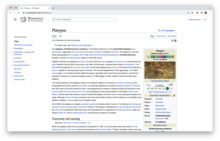
Platypus article on Vector 2022 - Can you try viewing the article in a private/incognito window?
- In general: the max-width takes into account the most common infobox sizes. Unfortunately, since we don't yet have global templates, there is a lot of variation in the widths. One way we might overcome this in the future is to make the max-width based on the width of the infobox, or just make some exceptions if the page is using a specific infobox template that is extra wide. AHollender (WMF) (talk) 19:45, 18 January 2023 (UTC)

Do not force the creation of a user account
I, amongst doubtless thousands of others, was surprised to find Vector2022 as the appearance of wikipedia this morning. I doubt most viewers of wikipedia were aware of this project, and in particular that this redesign was going to arrive. I do not particularly like Vector2022, finding it annoying and a solution in pursuit of a problem. However, new UIs being generated for no apparent reason is a common trend, and I begrudge that fact. What was particularly galling was the lack of ready options to revert from Vector2022 to legacy Vector 2010. The only options available at present time are to either append "?useskin=vector" to every single wikipedia URL, a loathsome process (though doubtlessly one that will soon be automated by browser extensions), or to create an account and revert the appearance in preferences. I chose the latter, and am not particularly pleased by that. I did not want a wikipedia account. I am not of the invaluable sort who edits and contributes to this resource. I do not care to log-in to a website that I do not really interact with outside of base research and answering questions.
Please implement an option to revert to Vector 2010 without the need for a user account. A great many of those who use this website will be grateful. DoubleSashed (talk) 19:39, 18 January 2023 (UTC)
- DoubleSashed I think the only way to avoid using the new skin is to create an account, sorry. 331dot (talk) 19:40, 18 January 2023 (UTC)
- Thank you @DoubleSashed for your opinion. The reason why logged-out users can not save their preferences on Wikipedia is strictly related to the privacy policy (we just don't collect that data) and the architecture of our servers (what you see as a logged-out user is mostly a cached version, and not a version generated directly from the database). So as a logged-out user, you may use a bookmarklet. Copy that code and just replace "monobook" with "vector". Here you will find more information on that. SGrabarczuk (WMF) (talk) 20:08, 18 January 2023 (UTC)
Mousewheel support?
Mousewheel scrolling doesn't seem to work in this skin. Is that a bug or a "feature"? VQuakr (talk) 19:39, 18 January 2023 (UTC)
- It works for me. 331dot (talk) 19:40, 18 January 2023 (UTC)
- Hi VQuakr could you share a little more information? Does the issue occur with your gadgets / user scripts disabled (e.g. on this URL https://en.wikipedia.org/wiki/Spain?safemode=1&useskin=vector-2022 )?
- Which browser and operating system are you using? Jdlrobson (talk) 19:52, 18 January 2023 (UTC)
- @Jdlrobson: Win 10 Pro/Chrome 109.
Does the issue occur with your gadgets / user scripts disabled?
sort of. It appears to be related to the TOC. If I expand the TOC enough to get a scrollbar, mousewheel will briefly scroll the TOC instead of the entire webpage, then switch to the entire page regardless of where I am hovering, then not scroll at all from mousewheel input (or, I'm seeing now, from left clicks on the light gray portion of the scrollbar or the direction arrows). But it's not totally frozen; keyboard input and click-drag on the scrollbar still have effect. The behavior is the same in normal mode as with safemode. VQuakr (talk) 20:05, 18 January 2023 (UTC)
- @Jdlrobson: Win 10 Pro/Chrome 109.
Help Desk/Teahouse questions
The Help Desk and Teahouse are getting flooded with questions about this; is there some sort of blanket announcement message that could be sent out, perhaps directing people here? 331dot (talk) 19:41, 18 January 2023 (UTC)
- @331dot - thanks, that's a good idea! We're currently running banners to all users. For logged-out users, it's directing them to a landing page with general information about the skin and links to give feedback on the main Mediawiki page for the project. For logged-in users, it's linking them here. Potentially we can add a link to this page on the landing page of the foundation site too so logged-out users can see both conversations. OVasileva (WMF) (talk) 19:51, 18 January 2023 (UTC)
I'm on the fence
This feels like it was meant for mobile users. Some thoughts
1) So much space on both sides can be used/employed for viewing. 2) For logged in users, a contributions link and should be visible with one-click, not as part of a drop down 3) for me, I rather see all the left hand column stuff as is, without having it "hidden" behind one button.
Ebbedlila (talk) 19:42, 18 January 2023 (UTC)
- Ebbedlila They are trying to balance the needs/wants of new users with those of longtime users. That's probably the reason for the drop down menu and left hand column stuff. 331dot (talk) 19:44, 18 January 2023 (UTC)
- Hi @Ebbedlila, thank you for your feedback, please look at this section of our FAQ. Patafisik (WMF) (talk) 19:45, 18 January 2023 (UTC)
How to go back without logging in?
I don't want to log in on this computer just to restore the site back to being functional. Awful, hideous change. 68.60.202.174 (talk) 19:46, 18 January 2023 (UTC)
- If there are specific concerns you have, please discuss them. Most if not all features are present, just in different places. This has been studied and developed for years to balance the needs/wants of every human on this planet, all of whom use the site differently. There may be browser extensions you can use to restore the old appearance, but without those, you will need to create an account to be able to use the old appearance. 331dot (talk) 19:48, 18 January 2023 (UTC)
- Hey! You may use a bookmarklet. Copy that code and just replace "monobook" with "vector". SGrabarczuk (WMF) (talk) 19:49, 18 January 2023 (UTC)
Misplaced, jumbled tables and images
It was pointed out at Wikipedia:Requests for comment/Deployment of Vector (2022) that the new skin crowds tables and images to such an extent that it misplaces and awkwardly stacks them. This was, and still is, evident on the very article supplied as an example in the RfC, Pluto, See Pluto#Mass and size section. This is happening on countless articles. See 2022 Formula One World Championship for example. It's mess now with the new skin. --DB1729talk 19:54, 18 January 2023 (UTC)
- This is a longstanding issue that severely impacts our mobile readers (forcing them to have horizontal scroll on the entire article). It an be fixed by editors like in this change using the instructions on mw:Recommendations_for_mobile_friendly_articles_on_Wikimedia_wikis#Wrap_wide_images_and_tables. Jdlrobson (talk) 20:22, 18 January 2023 (UTC)
The lack of space between the lead section and rest of the content makes every article look like a stub
Off all the changes this one is the one I'm least a fan off, it really does not jive with what I've become used to. Having the TOC below the lead section was easy on the eyes Imho. ★Trekker (talk) 19:58, 18 January 2023 (UTC)
- Can you give an example of an article URL wihich has this issue? Jdlrobson (talk) 20:17, 18 January 2023 (UTC)
- Hello! Thanks for your feedback - this is an interesting opinion, a rare one! I guess this is a bit of a tradeoff - sure, the previous look had some advantages the current one doesn't. But its disadvantages are the reason why we believe the change is an improvement nevertheless. You may learn more here about the tests we did, versions we compared, and related stuff. (And just as Jon, I'm curious if there are any specific articles where this looks particularly odd.) SGrabarczuk (WMF) (talk) 20:18, 18 January 2023 (UTC)